
▶️ Final Design
🔍 Research Phase
To ensure Playback followed watchOS design principles, I conducted secondary research using Apple’s watchOS guidelines to optimize readability, contrast, and tap-friendly interactions for a smartwatch. Given the smaller screen, I prioritized glanceability. For content accuracy, I researched album release dates using Loudwire to ensure the prototype displayed reliable information.


🎨 Design Phase
Using Procreate, I sketched the core screens to visualize the app’s structure and refine interactions before moving into high-fidelity design. This process helped me explore layout, hierarchy, and user flow while ensuring a glanceable and intuitive smartwatch experience.
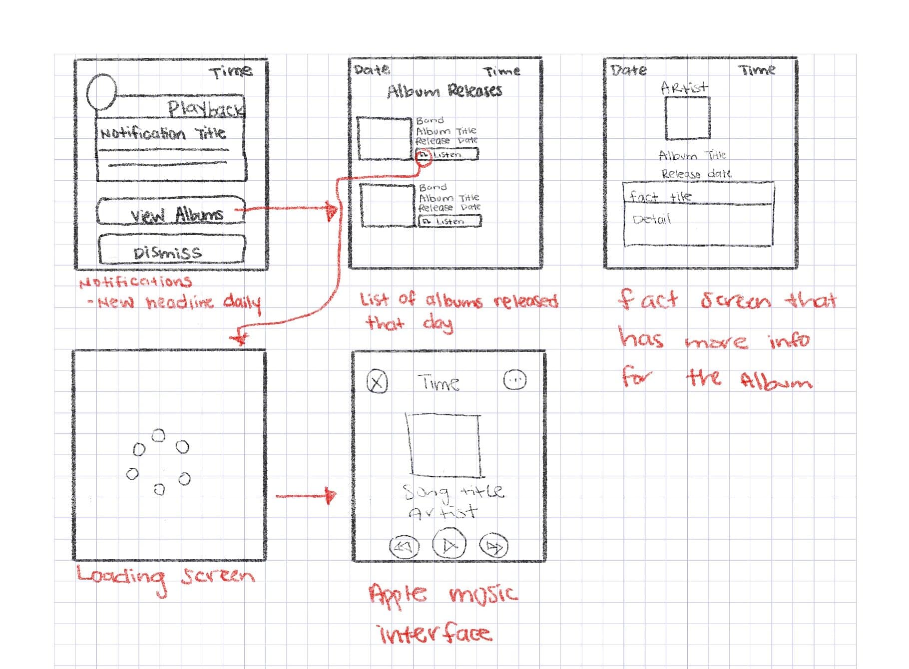
Notification Screen: Designed for quick engagement, allowing users to instantly see album anniversaries and take action.
Album Release List: A scrollable list displaying albums released on the current day, keeping interactions minimal for efficiency.
Album Detail Screen: Initially, I considered this screen for daily rock history facts, providing extra context about the album’s impact. While I decided to remove it for now to keep the experience fast and streamlined, this is an idea I’d love to explore in the future to further enrich music discovery.
Loading Screen: Added to provide visual feedback when retrieving data. Since Apple Watch sometimes displays loading screens when switching between apps, I included this to maintain consistency with watchOS behavior and set user expectations.
Apple Music Integration: Features tap-to-play controls, enabling seamless music discovery.
Wireframe Sketches
Design Highlights


📝 Reflections & Next Steps
Designing Playback reinforced the potential of music discovery beyond streaming platforms. By merging rock history with smartwatch accessibility, this concept encourages users to engage with music by learning as they listen. The project also highlighted how smartwatch UI can enable quick, meaningful interactions, making discovery effortless. Following watchOS guidelines pushed me to refine information for clarity, glanceability, and usability. Looking ahead, I’d love to expand this concept by:
- Adding a “Learn More” feature for deeper insights into album milestones and cultural impact.
- Refining the logo and UI based on user feedback for a more seamless experience.
- Introducing daily rock trivia to engage users with interactive challenges.
- Implementing genre filters to let users customize notifications based on their rock music preferences.


