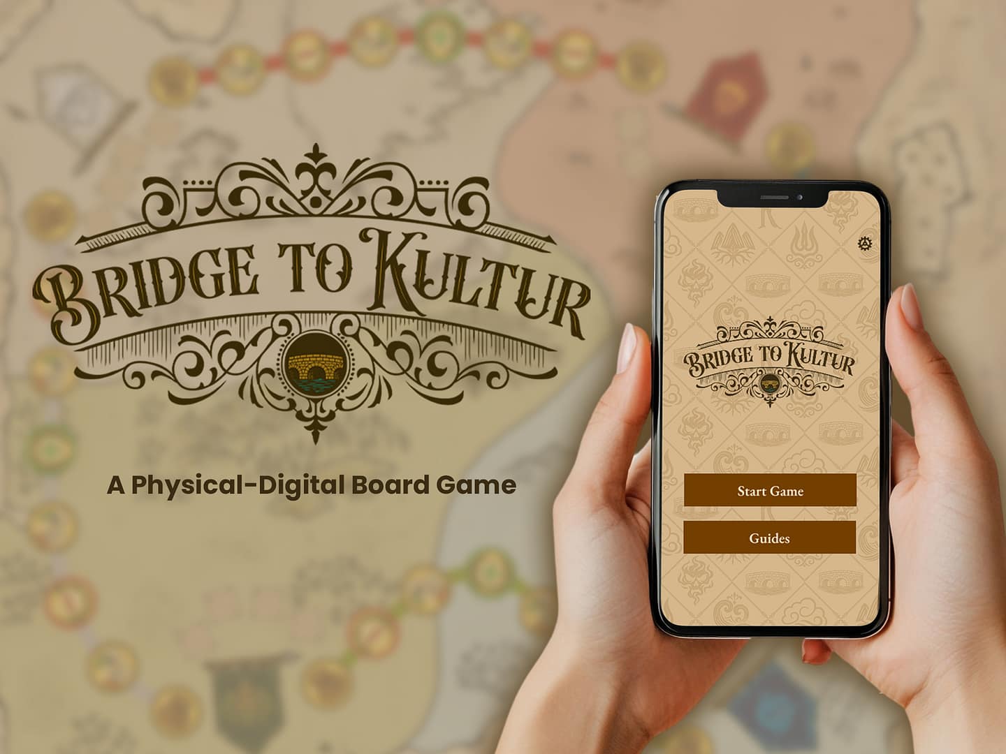
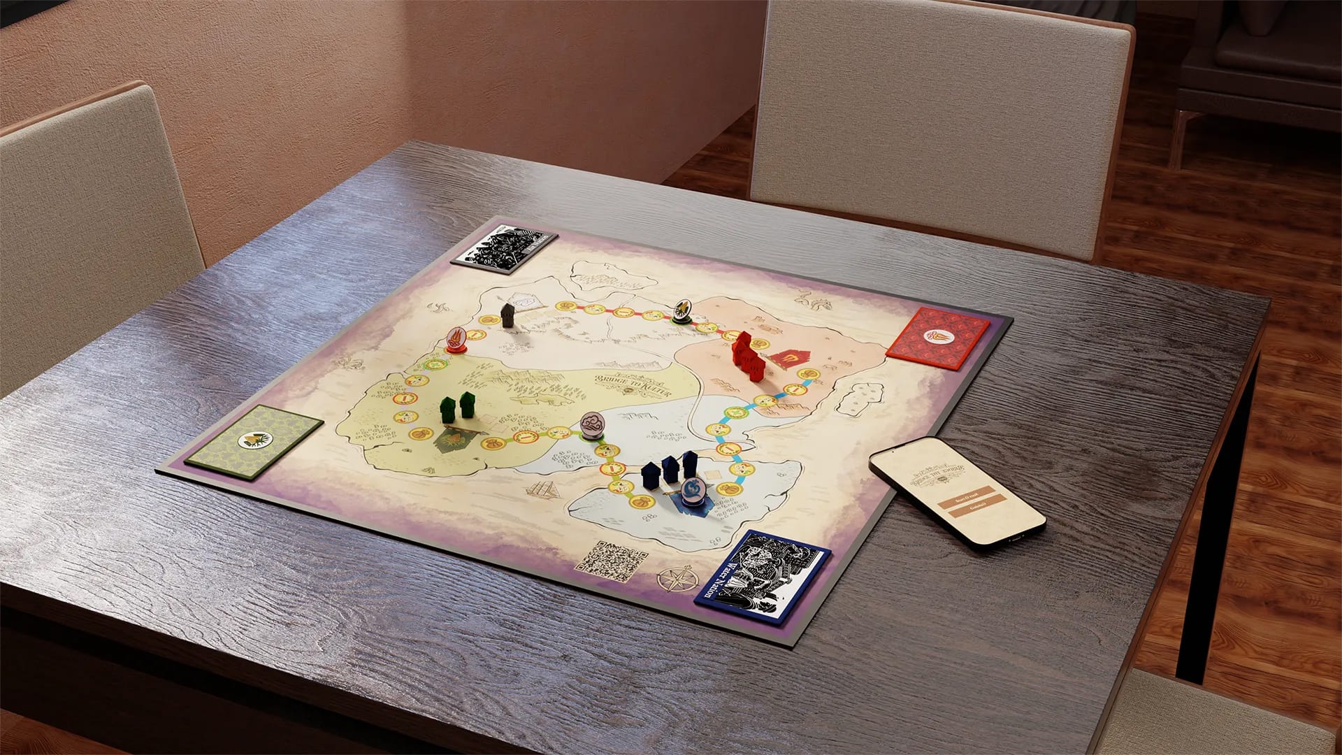
▶️ Final Design and Digital Prototype
🔍 Art Research
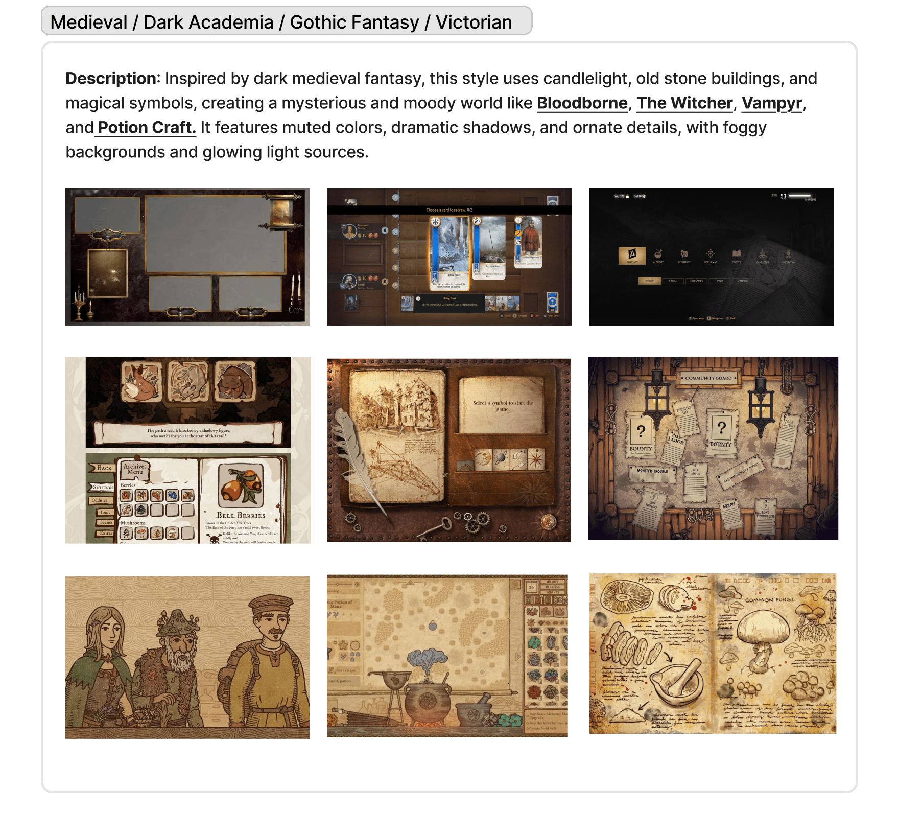
Bridge to Kultur’s art research began with exploring possible visual directions. I created several mood boards—each focused on a different style, including Ethereal Fantasy, Retro Pixel Art, Solarpunk, and Medieval / Dark Academia. Each board came with descriptions, tone notes, and visual references to help the team imagine how it could shape the game’s atmosphere.
After reviewing the options, we chose the Medieval / Dark Academia style. Inspired by games like Bloodborne, The Witcher, Vampyr, and Potion Craft, this style uses candlelight, aged textures, and detailed illustration to create a serious, mysterious tone—ideal for a game about trust, negotiation, and survival. This process made sure the final art direction wasn’t just stylish, but thematically connected to the game’s world and mechanics.


🎨 Design Process
My first attempt at a style guide used AI-generated visuals to set the game’s tone. While helpful for mood and early ideas, they lacked consistency, structure, and usability; fonts, icons, and colors varied too much for functional UI. Rebuilding elements in Illustrator looked too clean and modern, clashing with the historical aesthetic. Ultimately, I scrapped this approach and rebuilt the style guide from scratch, using the AI output only as loose reference.


I also created an early set of simple faction icons to match the UI, but they felt too plain and didn’t say much about each group’s identity. The Air faction logo stood out with its more stylized, flowing design that suggested movement and character. The team immediately responded to the Air logo and suggested the others be brought up to that level. From there, I used it as a reference to redesign the rest of the faction icons with more personality and visual meaning.
Art Direction Changes
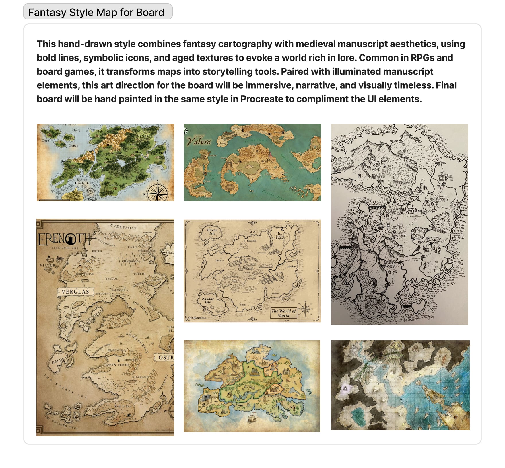
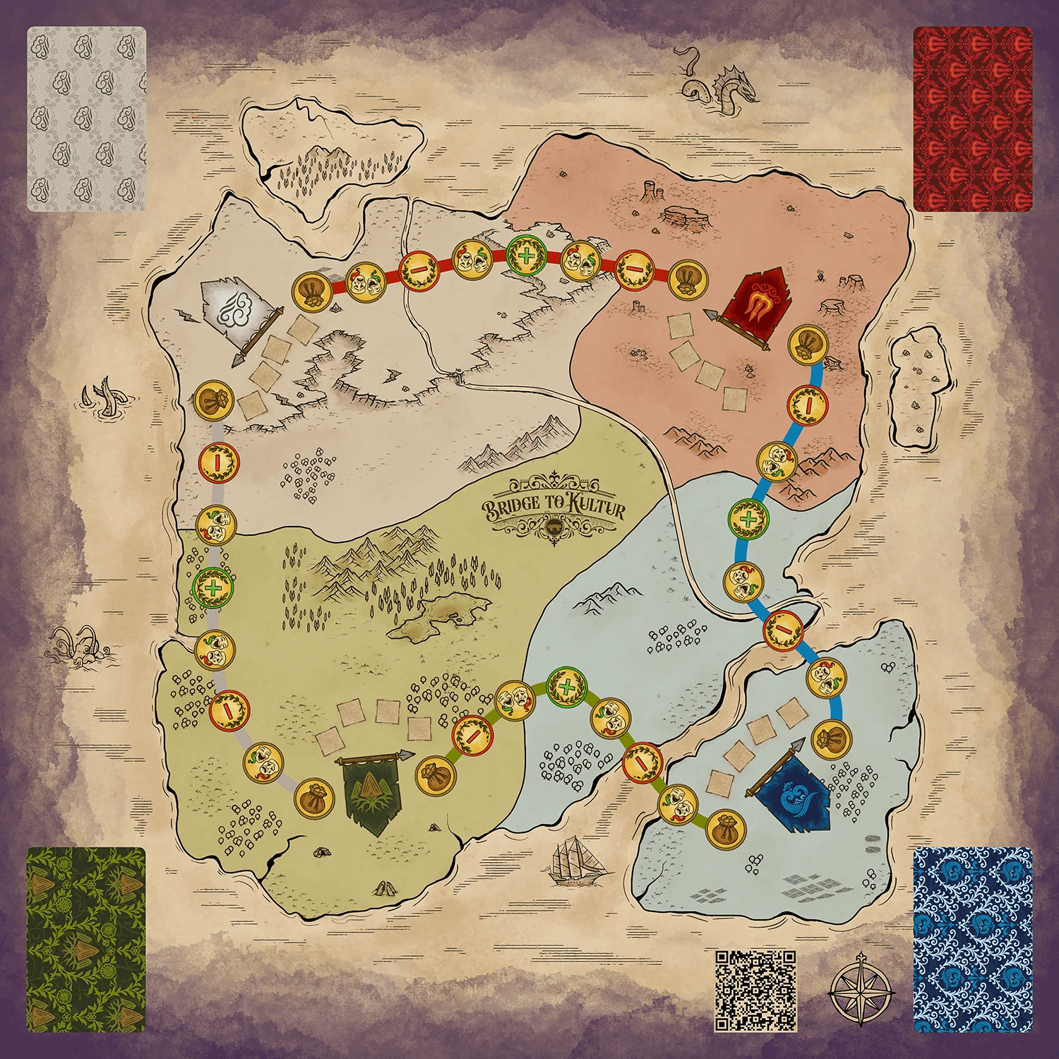
The first styles I tried, AI-generated and vector graphics, looked too clean and modern. They lacked the texture and aged feel needed for a game rooted in history, trust, and survival. To fix this, I branched off from the original Medieval / Dark Academia mood board and created two more focused ones. One centered on medieval manuscript art to guide the overall visual style, and the other featured fantasy-style maps to help my teammate, Alexander Johnson, design the board in a way that complemented the final aesthetic. This kept the interface and board visually connected while allowing each to develop independently.
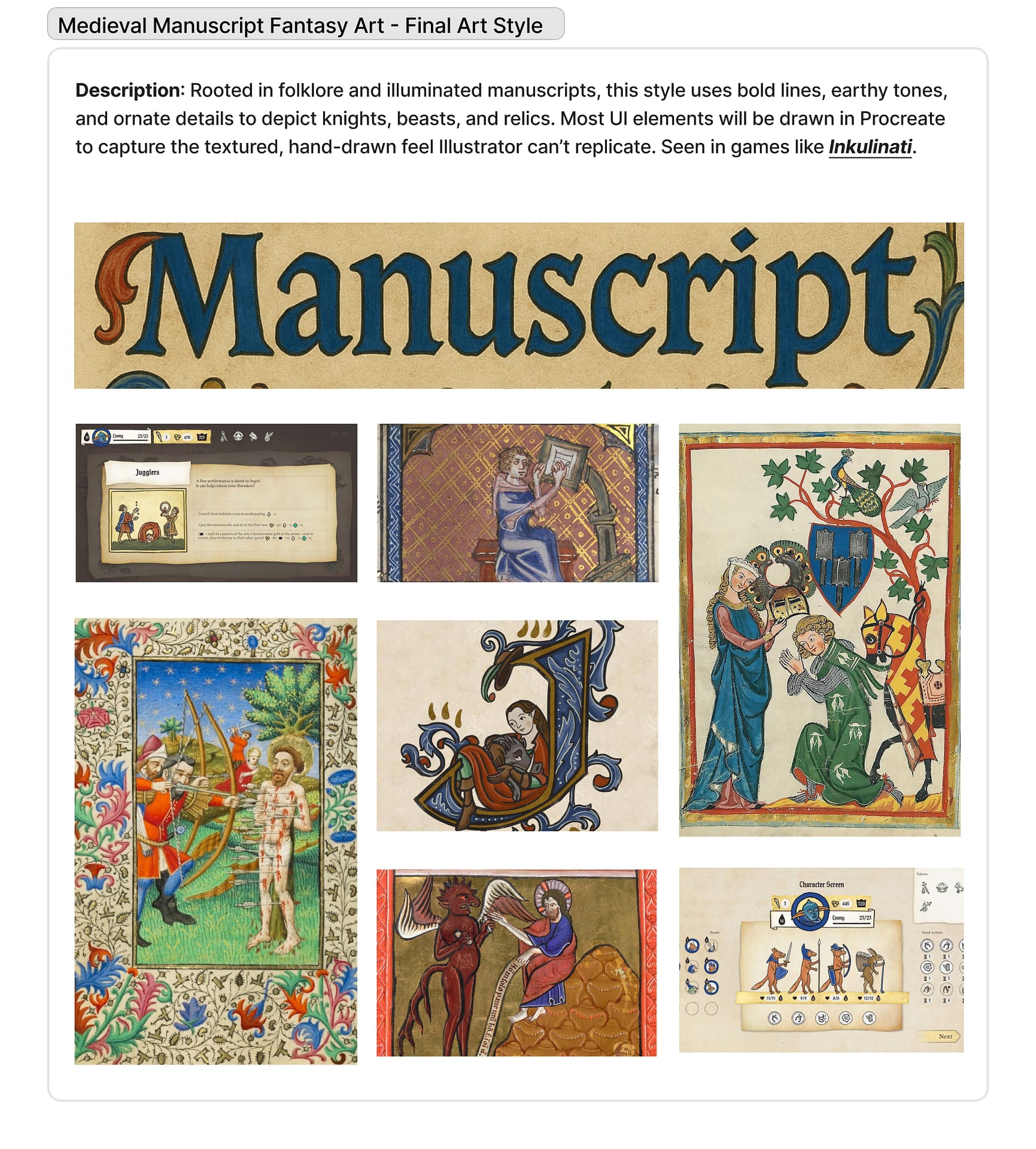
Using manuscript references, I redrew all game assets by hand in Procreate. While raster art isn’t usually ideal for UI because it doesn’t scale as cleanly as vector, its textured, imperfect quality gave the visuals the aged, handmade character the game needed. A single coin test proved the approach worked, balancing authenticity with readability, so I committed to raster artwork as the foundation of Bridge to Kultur’s visual identity.


Once my teammates, Marcus Thomas and Sammy Schrier, completed the Game Design Document (GDD), I designed logos for the Fire, Water, and Earth factions directly from their lore. Each design became a visual shorthand for the faction’s core values and story. For example, the Fire logo blends a trident and a flame, representing their focus on weapons, combat, and survival in harsh desert conditions—it captures their belief that power must be earned through action. From there, I developed custom repeat patterns from each logo to use on scenario cards, ensuring the visuals tied back to faction identity at every touchpoint.


🧪 Feedback and Iteration
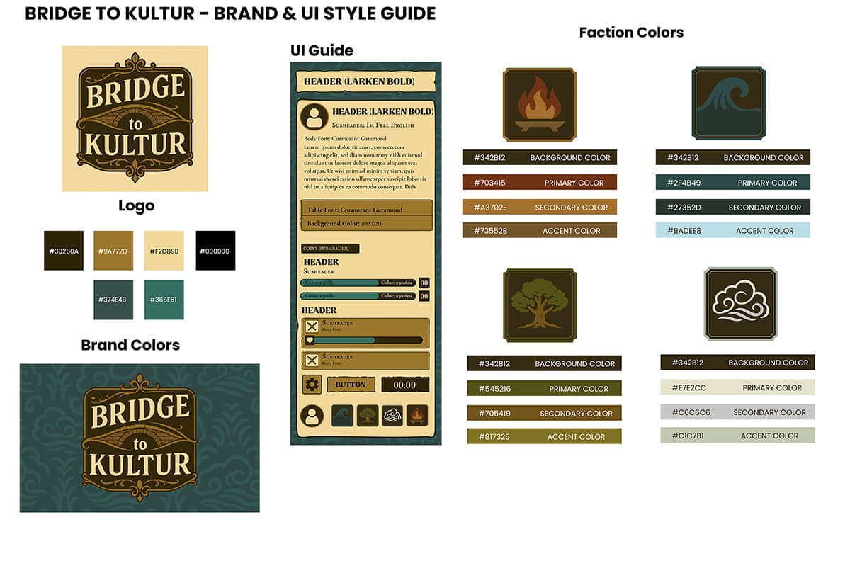
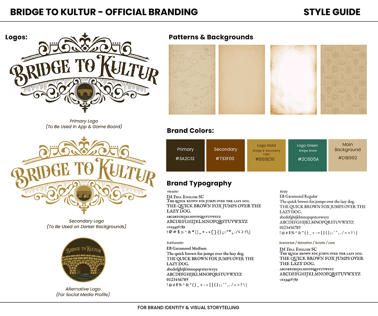
The original style guide established the game’s antique-inspired identity with ornate logos, aged textures, and a dark green palette. When applied to the UI, however, feedback revealed contrast issues that made text and buttons difficult to read. Using tools like WebAIM’s contrast checker, I refined the palette—lightening backgrounds, rebalancing colors, and adjusting text hierarchy to improve readability without losing the game’s tone.
These tests also highlighted issues with the faction banners. The original full-color flags worked well for the board game but reduced clarity in the app. To resolve this, I simplified the app banners with white backgrounds for better contrast and quick recognition, while preserving the full-color versions for the physical game.
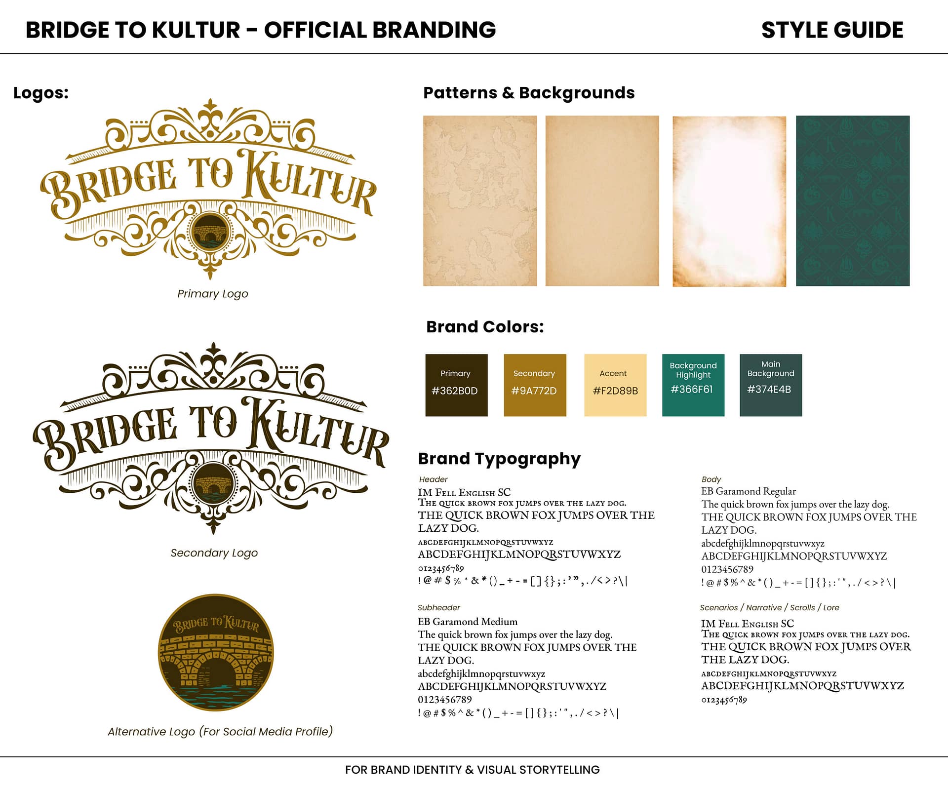
Final Style Guide
The final style guide unified visuals for both the board game and the app. A key change was replacing the dark green background, which was bold but clashed with parchment textures, with a cleaner palette. Green was retained as an accent in the logo to highlight the bridge graphic, making it usable as a standalone mark for app icons, UI, and social media. The guide defined updated colors, fonts, textures, and logo rules.
Design Highlights
The medieval manuscript style was a natural fit for Bridge to Kultur because it reflected the game’s core themes of legacy, diplomacy, and survival. Like illuminated manuscripts that once recorded history and values, the game centers around storytelling, faction identity, and the lasting impact of decisions. Hand-drawn textures, parchment backdrops, and rough linework made the world feel aged, like something preserved from another time.
This style also supported gameplay clarity. Every icon was chosen with symbolic meaning, much like illustrations in medieval manuscripts, making mechanics easier to understand while reinforcing the narrative tone.


For scenario outcomes, I used classic drama masks rooted in ancient and medieval theater: two crying masks with a red border meant failure, two smiling masks with green meant success, and one happy and one sad mask were the default, unrevealed event. These made emotional outcomes easy to read and added to the game’s narrative tone.


I also used laurel wreaths—symbols of honor and recognition throughout history—for passive events. A full laurel with a green plus sign and border symbolized a passive gain, while a broken laurel with a red minus sign and red border showed a loss. These symbols helped explain mechanics while reinforcing the emotional weight behind each move. The board also included a coin bag icon for trade, tying into the game’s trading system.


📝 Art Direction Learnings
Bridge to Kultur proved how deliberate art direction can shape both tone and clarity in a game system. The medieval manuscript style gave the project its distinct identity, grounding mechanics in a handcrafted world of diplomacy, trust, and survival.
Looking ahead, the visual system could expand through collector’s editions that heighten immersion:
-
Cloth banners for each faction, extending heraldic identity beyond the board.
-
Sealed documents styled as royal decrees, reinforcing the Calamity’s narrative weight.
-
Faction coins as tactile artifacts of loyalty and trade.
-
Scroll-style rulebooks and traveler’s journals, blending gameplay with in-world storytelling.
On the digital side, the app could mirror these aesthetics through unlockable extras like faction-themed backgrounds, parchment overlays, or lore fragments revealed as players progress. I’d also continue refining the UI by redrawing faction logos and patterns in the manuscript style, further unifying the game’s handcrafted identity.
Art Direction Under Constraints
Working within an academic timeline came with limitations, but they directly shaped my approach as a creative director:
- Tight deadlines pushed me to prioritize clarity and core visual function over extra polish.
- Limited time focused my design energy on the highest-impact assets.
- Balancing scope across physical and digital components ensured cohesion under real-world constraints.
These constraints sharpened my ability to make decisive, impactful creative choices under pressure—skills that translate directly to professional art direction.


